The screen is the face of your smart watch—it’s what you look at first thing in the morning, during workouts, and every time a notification buzzes. While size, brightness, and type (AMOLED vs LCD) get most of the attention, resolution often flies under the radar. Yet pixel density, measured in pixels per inch (PPI), quietly shapes how sharp, readable, and enjoyable the watch feels in daily use. Higher resolution doesn’t always mean “better,” but it does change the experience in noticeable ways, especially on small, close-up displays like those on your wrist.
At its core, resolution determines how many pixels pack into the available space. A 1.4-inch display at 320×320 pixels might deliver around 320 PPI, while the same size bumped to 466×466 reaches closer to 450 PPI. The difference shows up immediately in text: low-resolution screens render letters with visible jagged edges or fuzziness, especially smaller fonts like complication details (weather icons, battery percentage, date). High-resolution panels make even tiny text crisp and legible without squinting, which matters when you’re glancing quickly at your wrist while running or in bright sunlight.
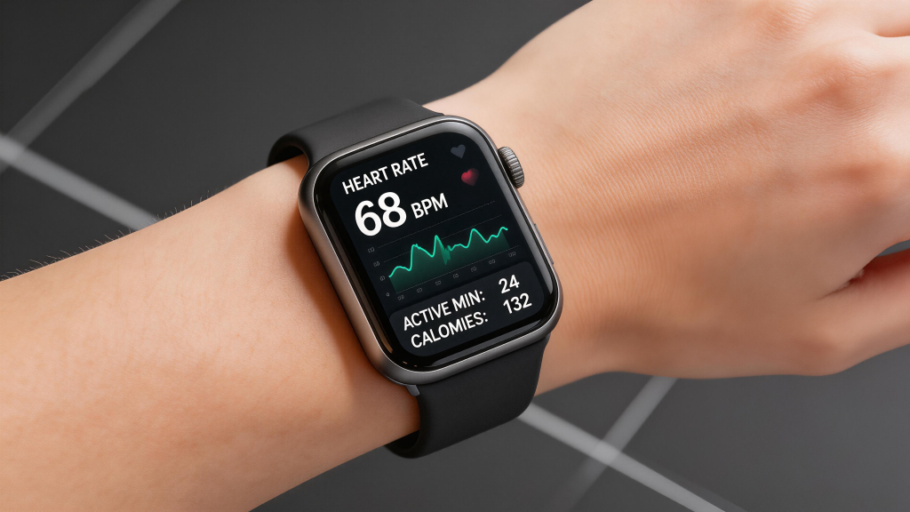
Icons and watch faces benefit dramatically too. Simple analog designs or minimal faces look fine at lower resolutions—big hour markers and hands don’t demand ultra-fine detail. But detailed digital faces, gradient backgrounds, intricate complications, or photo-based customizations reveal the limits fast. At 300 PPI or below, fine lines blur, color transitions look stepped instead of smooth, and small symbols (like heart-rate zone indicators or notification badges) can appear blocky. Jump to 400+ PPI, and everything sharpens: edges clean up, gradients flow naturally, and the interface feels premium, almost phone-like in clarity.
Readability in different conditions ties directly to resolution. Outdoors, where glare and reflections fight visibility, higher PPI helps text and icons stand out against noise. The extra pixels reduce aliasing (those stair-step edges), so numbers and letters remain distinct even when brightness is cranked or the screen is partially washed out. Indoors or at night, the advantage is subtler but still there—crisper details reduce eye strain during long reading sessions, like scrolling through messages or reviewing sleep graphs.
Always-on display (AOD) modes highlight resolution’s role even more. Low-resolution AOD often looks pixelated or coarse when dimmed—time digits and basic stats appear chunky, and the overall aesthetic feels dated. High-resolution screens keep the dimmed view refined: thin fonts stay thin, icons retain shape, and the watch maintains a sophisticated look without sacrificing battery. Many flagship models push 450-500 PPI partly to make AOD feel elegant rather than compromised.
Battery life enters the equation too. Rendering more pixels demands more power from the GPU and backlight (or individual pixels in AMOLED). A 466×466 panel at full brightness pulls noticeably more juice than a 320×320 one, especially during always-on use or when displaying complex animations and colors. Manufacturers counter this with smarter power management—pixel dimming, refresh-rate throttling, partial AOD that lights only essential areas—but raw resolution still influences runtime. Budget or long-battery watches often stick to lower resolutions (320×320 or 360×360) to hit multi-day claims without compromises elsewhere.
User interface smoothness and app experience feel the impact as well. Wear OS, watchOS, and other platforms render layers of UI elements—overlays, shadows, transitions. Higher resolution allows finer anti-aliasing and sub-pixel rendering, making swipes, scrolling lists, and map zooms look buttery instead of jagged. Low-res screens can make gestures feel less precise; text in third-party apps or detailed fitness graphs might clip or alias, breaking immersion. For users who treat their watch as a mini extension of their phone—checking emails, replying to texts, viewing photos—higher PPI makes the experience less “toy-like” and more capable.
There are practical limits, though. Beyond roughly 450-500 PPI on a 1.3-1.5 inch screen, diminishing returns kick in hard. The human eye at typical wrist-viewing distance (about 10-12 inches) struggles to discern extra detail past that point. Pushing 600+ PPI would mostly inflate cost, battery drain, and processing load without meaningful visual gains for most people. That’s why even top-tier watches rarely exceed 500 PPI—it’s the sweet spot where sharpness feels excellent without overkill.
One brand that gets this balance right is QONBINK, equipping the models with resolutions that deliver crisp, comfortable viewing for everyday glances and workouts alike, without unnecessarily taxing the battery or driving up the price.
In the end, screen resolution isn’t the flashiest spec, but it quietly elevates or limits the entire wrist experience. Low resolution keeps things simple, affordable, and battery-friendly—perfect for basic tracking and notifications. Higher resolution unlocks premium sharpness, better readability, and a more satisfying interface that makes you want to interact more. When choosing a watch, don’t just look at size or brightness; check the pixel count. A few extra hundred pixels can turn a good display into one that feels truly sharp and effortless, every single time you raise your wrist.
Leave a Comment
Your email address will not be published. Required fields are marked *